Back
Back
Prototyping
Mood Exploration
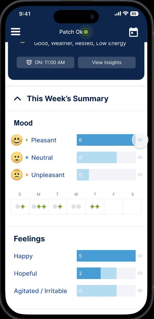
For this project, we wanted to show the value added to the system by a user's daily check-in. While I've covered this project more in depth in my case studies, this prototype demonstrates both how we crafted a scannable, meaningful dashboard using their data and how that dashboard can be easily filtered to more easily see the datapoints that tie to a given entry. For instance, if you logged that you felt "pleasant" and click the correspending icon, you'll see only those entries for 1) how you felt more specifically, 2) causes/contributing factors to those feelings, 3) sleep quality, 4) energy level, and 5) steps. This all makes it much simpler to find patterns and trends that affect your life the most and to then talk about those with your doctor. (Figma)
Mood Exploration
For this project, we wanted to show the value added to the system by a user's daily check-in. While I've covered this project more in depth in my case studies, this prototype demonstrates both how we crafted a scannable, meaningful dashboard using their data and how that dashboard can be easily filtered to more easily see the datapoints that tie to a given entry. For instance, if you logged that you felt "pleasant" and click the correspending icon, you'll see only those entries for 1) how you felt more specifically, 2) causes/contributing factors to those feelings, 3) sleep quality, 4) energy level, and 5) steps. This all makes it much simpler to find patterns and trends that affect your life the most and to then talk about those with your doctor. (Figma)
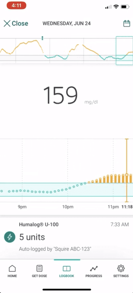
Diabetes Management
Enumerating all of the problems we resolved here would require a deep dive into diabetes, the existing technologies, and the issues found in human factors testing. There is a description of the prototype on YouTube, where you can see this in action.
If a picture is worth a thousand words, a movie is worth a million. While there's nothing quite lilke holding it in your hand and feeling the haptics and seeing visuals respond to your gestures, the movie is at least pretty good at showcasing the coordination and traversal of data, which, incidentally, tested better than people currently using our competitors—after just one use in the lab.
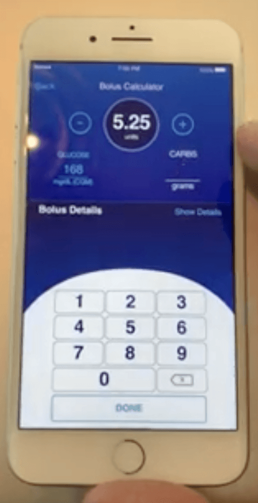
Speeding Up Common Tasks
Here, our human factors lab discovered some issues with a very common but multifaceted process in the existing system. The design team reviewed the errors and the interface and thought that it might be better to reduce the number of screens in order to show how the parts relate to one another. The result was improved understanding and time-on-task, even with one use in the lab. (More details in the description section on the unlisted YouTube short.)
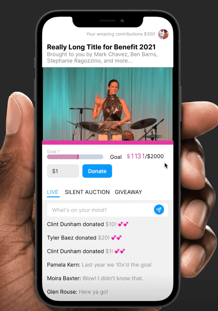
A More Engaging Benefit
This company had a stale, non-responsive design for its benefits software that needed more than just a mobile facelift. So much technology was left on the table with their static web app that I focused the bulk of my energy for this hackathon on building engagement through dynamism and achievable collective goals, essentially taking this old benefits software to a more up-to-date, fun platform where people can donate, be thanked, cheer on others, and collaborate in the name of charity.
Since change is best viewed in motion, I made an interactive prototype to allow people to chat with an automated crowd, make donations, and see how those donations contribute to the goals set.