Design Systems
Kelly Design System
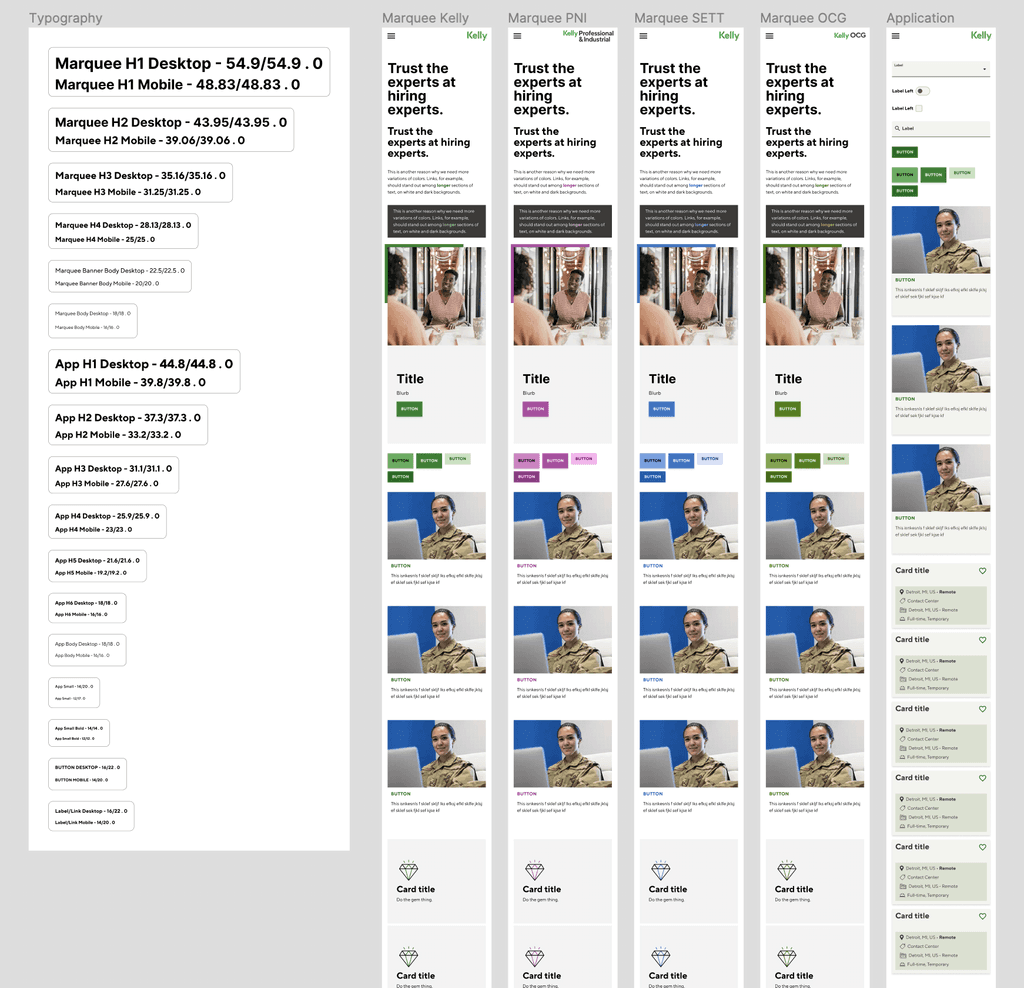
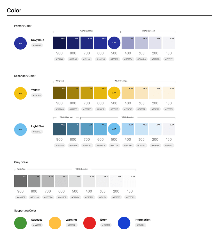
Using Figma's new variable feature, I was able to easily create a scalable, themeable design system that could be switched with the click of a button. I also distinguished app components and styles from marquee components and styles, although the two intersect at the lowest level of body copy, labels, and form components. This means app users can enjoy getting things done without a lot of flash while business stakeholders feel our brand is accurately relayed to our broader audience.
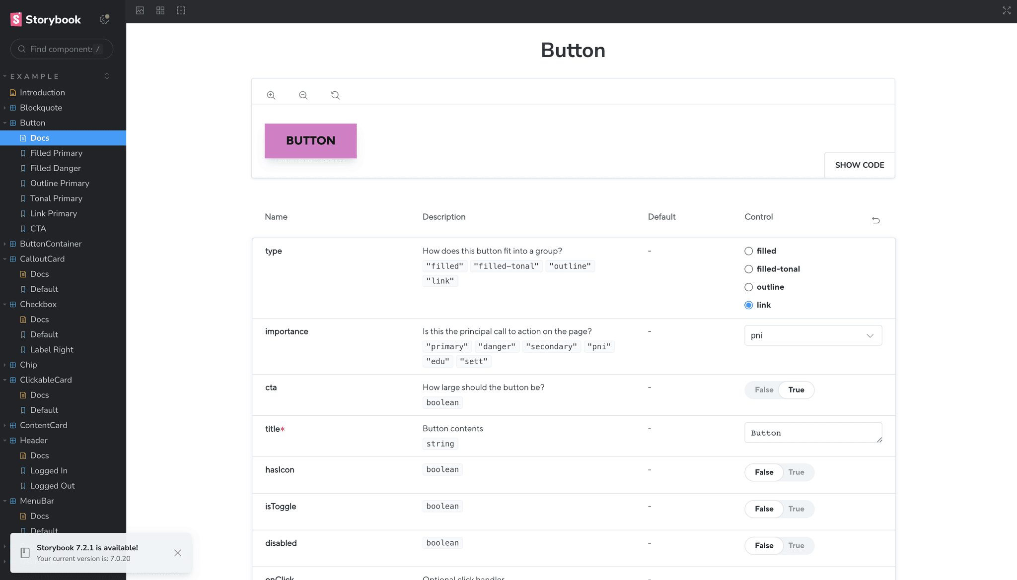
I didn't stop at Figma, though. I bounced between React/CSS/Storybook and Figma to create the scalable, accessible system with colors based on generated shades that came from our existing non-web-based brand guide. I used these additional technologies to make sure our animations and microinteractions were accurately modeled and translated as well as determining exactly how each component scaled at various sizes. To do this, I reused and modified a component library I made for the graduate course I teach and added a Storybook JS instance after my playground was in good shape. It might sound like overkill, but, with this extra effort, we were finally able to keep all our various vendor devs and designers focused on what mattered to us: the experience.

More Design Systems
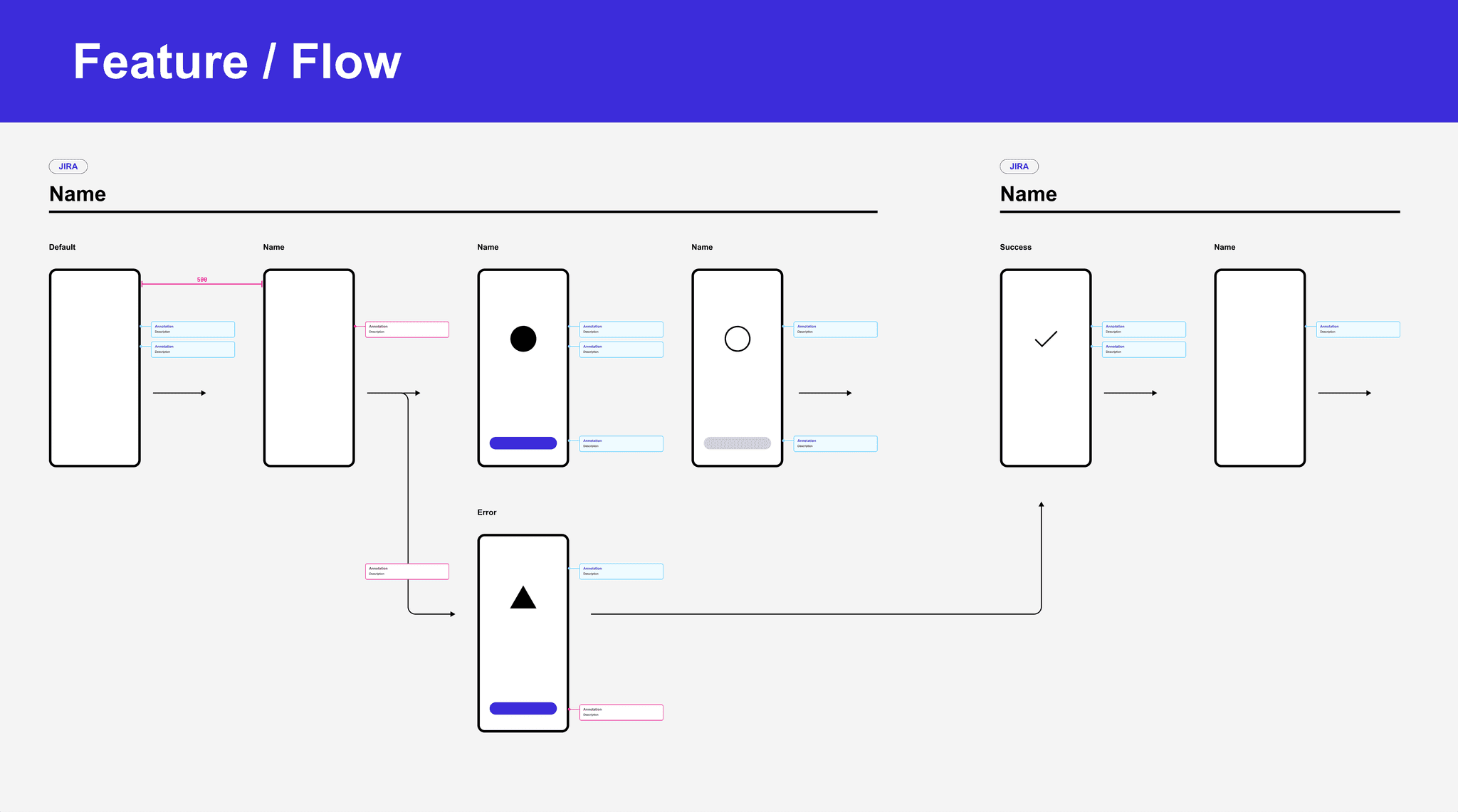
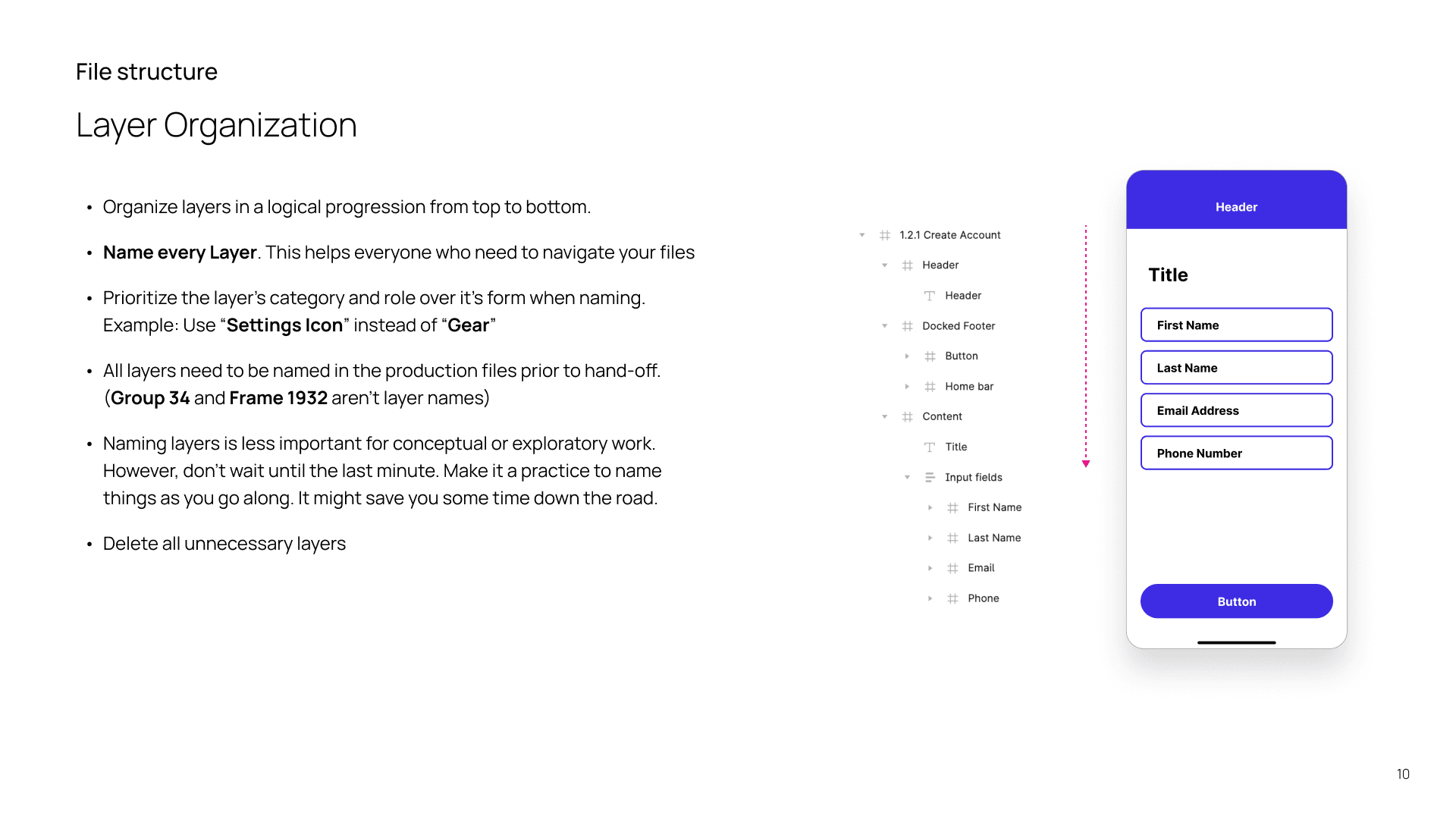
The following work was part of a much larger body of recommendations for building out design systems.
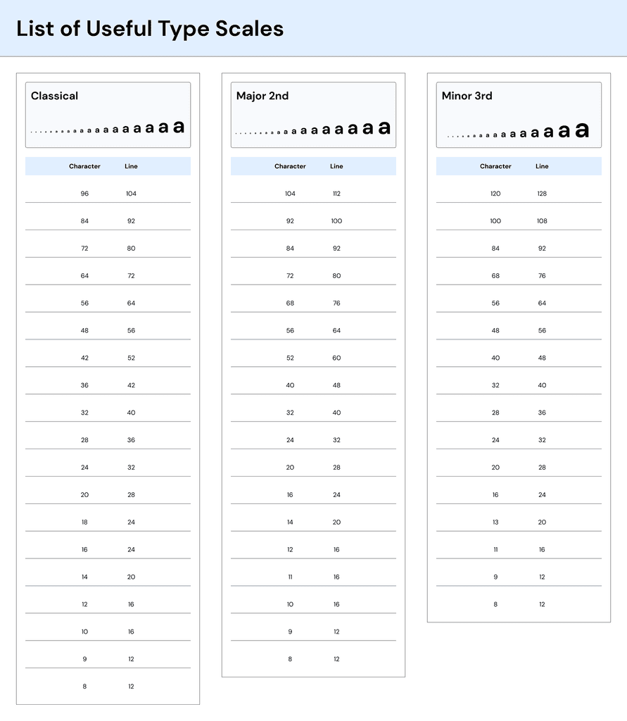
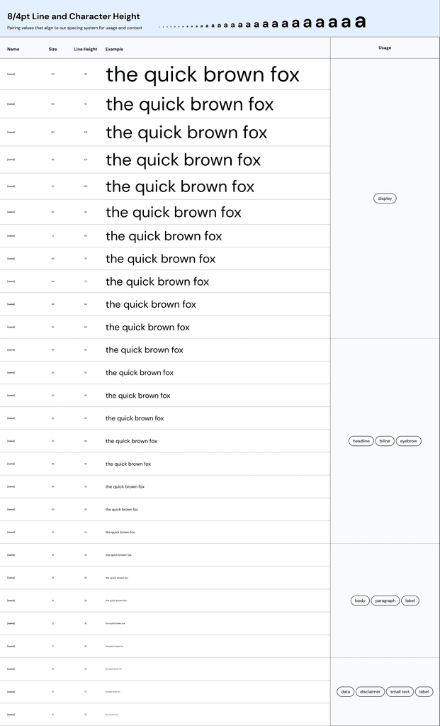
Recommendations on file structure and communication are also helpful. Design systems are all about consistency, after all.