The following are from our exploration and design planning efforts for myKelly, a job board and employee resource platform, all in one. Kelly Services is a staffing agency committed to securing employment for candidates and keeping them employed long-term. By creating a seamless experience from job seeking to employment (and back), we hoped to retain our talent and find them not just the right job but the right career.
A 0-1 responsive streamlining of the candidate and employee experience
My role on this project was to facilitate research, craft the overarching experience with CX, and serve as our in-house interaction designer to co-create and oversee the work done by our platform vendor.
Vision, Journey, Analysis
At Kelly, we worked with a research group that interviewed Kelly employees and job seekers to better inform us of the talent experience with other agencies and with Kelly. We distilled the findings from the research group into high-level themes that we then presented to Kelly leadership and our service's stakeholders. Once everyone was briefed, we brought them together to show our understanding of the Kelly talent experience (Chart 1) and how Kelly could deliver on our talents' desires.
From there, we broke down the talent journey into a journey map, using stakeholders to share their experiences in their specific domains, recognizing that a one-size-fits-all approach would not work for our talent or our company. Bringing together our internal expertise made for a more informed understanding of how our talent are served and how they could be better served. We also collected others' ideas for improvement for our new platform, combined those with our own, and grouped them into categories that were then translated into a roadmap.
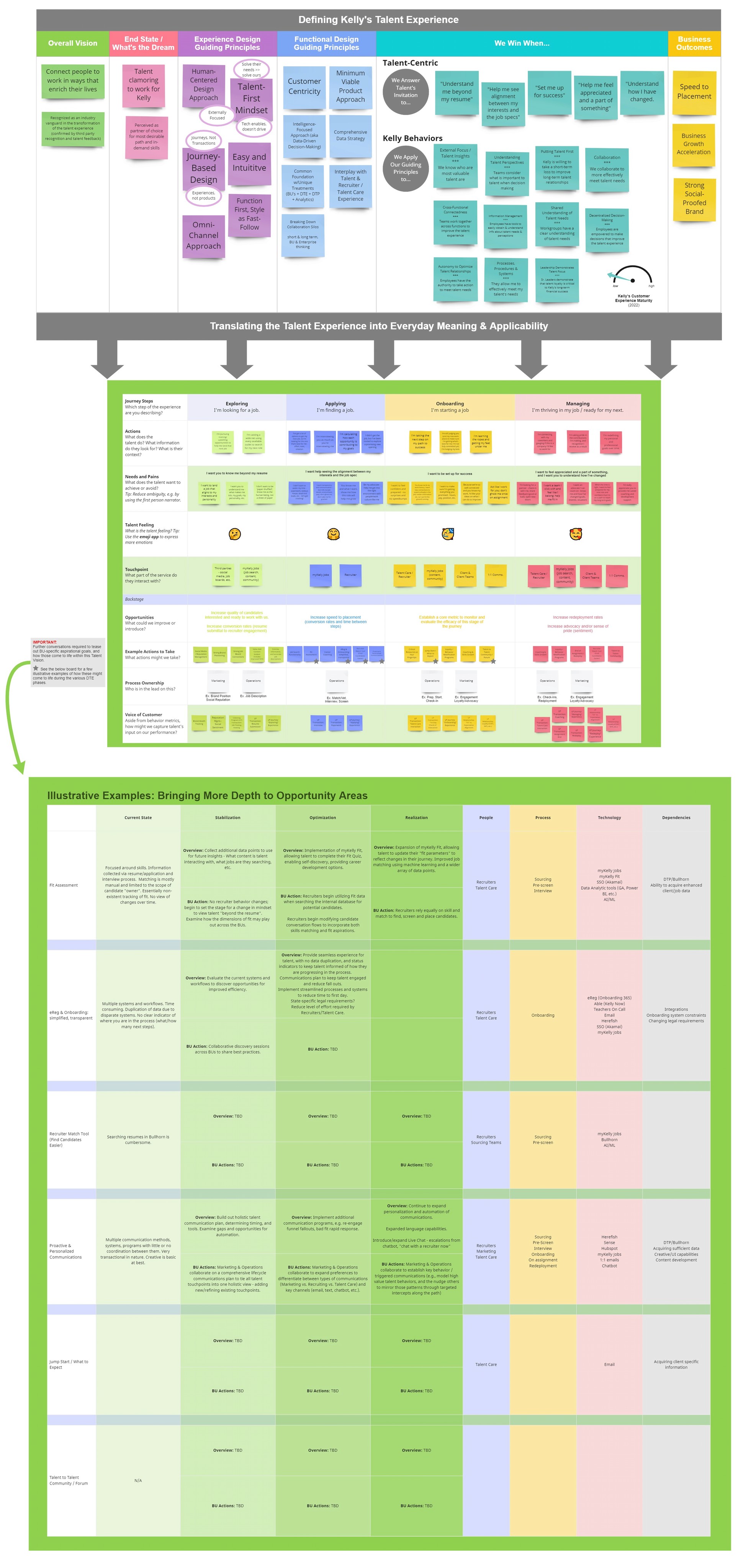
Vision Translated
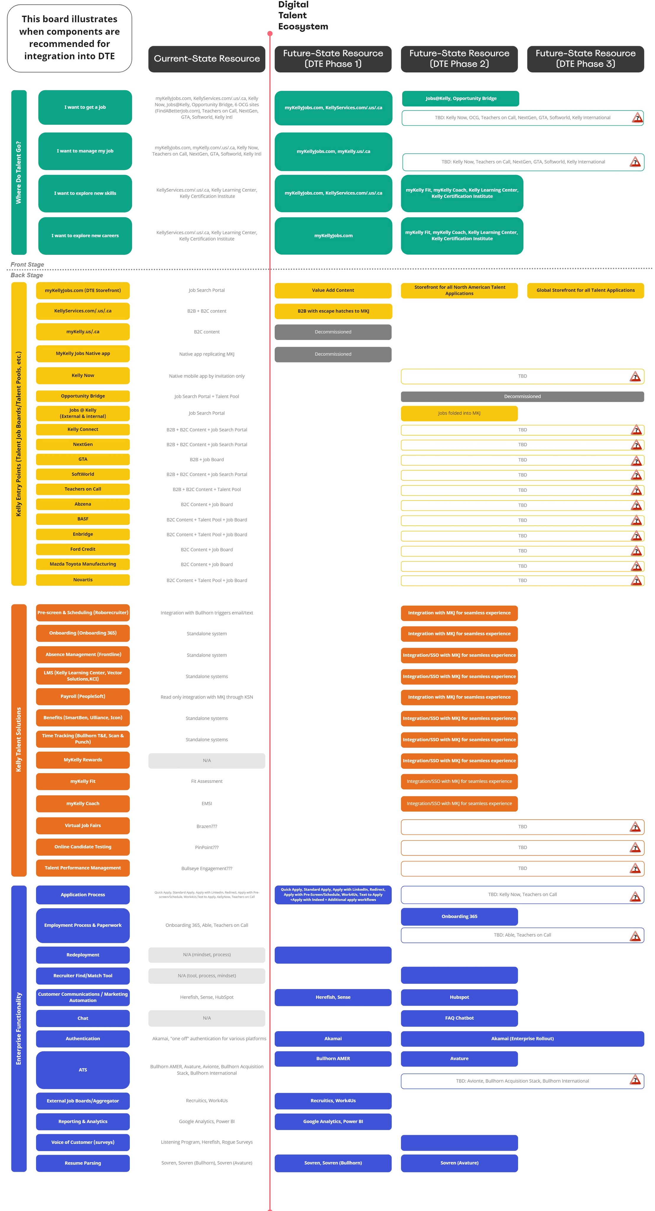
To get a full understanding of what we needed to deliver, we had to understand the technologies that our talent and our business were already using to communicate and perform work. Obviously, our goal was to pare these systems down and create a more straightforward experience.
Our goal here was twofold:
1) Inform leadership of what we'd planned on keeping and what we'd planned on ditching.
2) Show how the tools we were either keeping or introducing would fill those gaps and when.
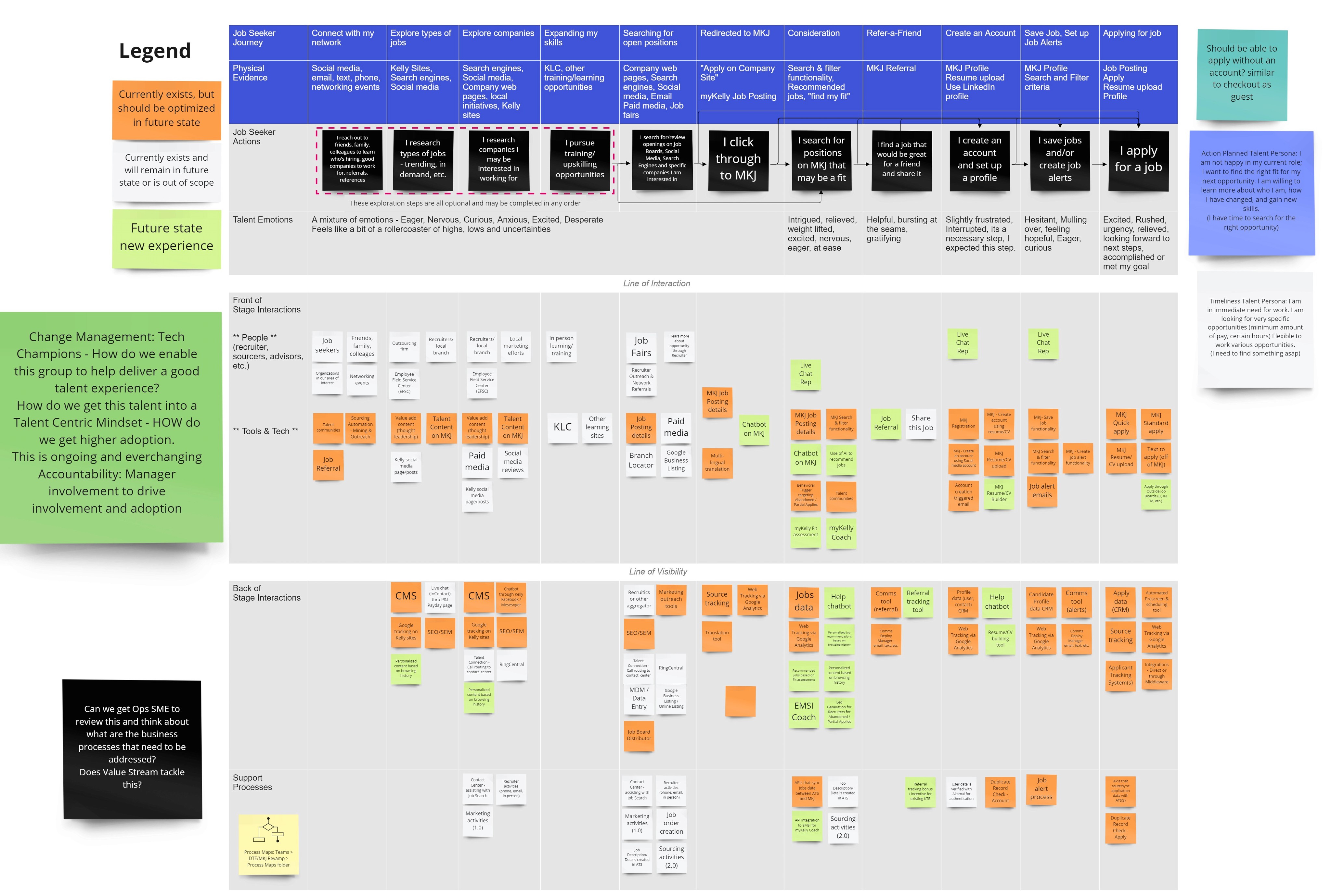
Experience Map
We then began moving towards mapping our experience, minding which tools would be necessary for accomplishing those tasks. This map was for a new talent discovering a job and applying through our new platform.
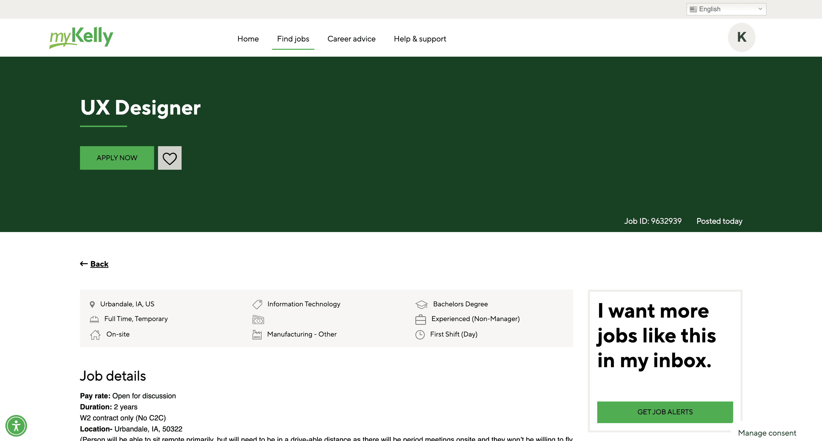
Wireframes and Mockups
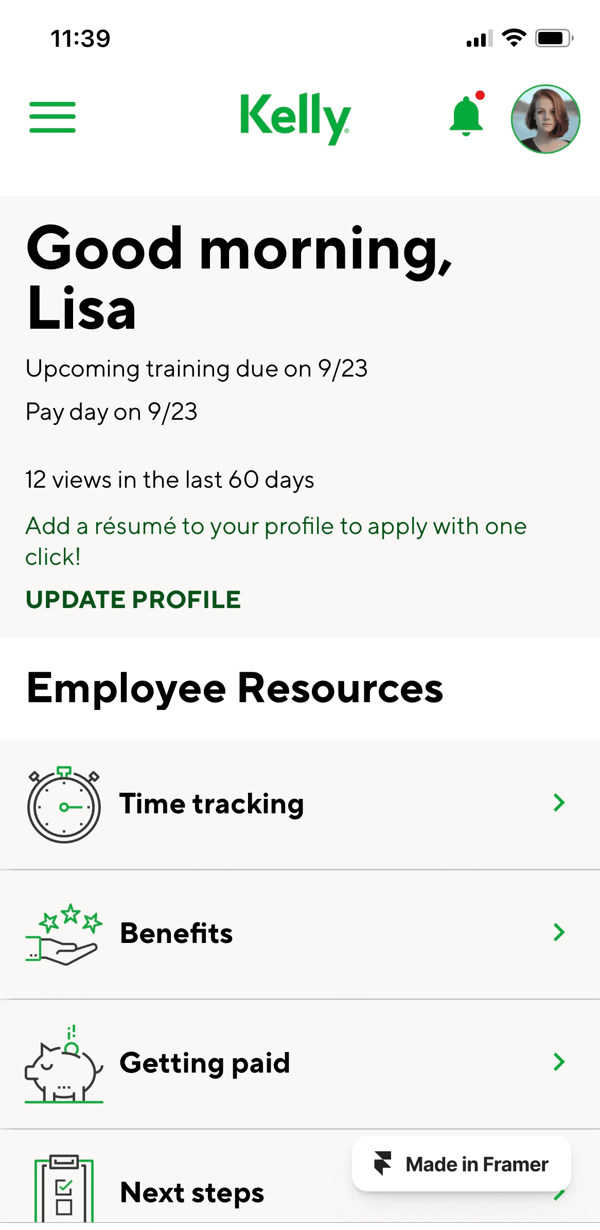
Next, we began sketching out, wireframing, and mocking up the screens for our experience. I kept mobile in mind from the beginning and worked my way outward to different sizes. Framer greases the wheels on responsive design so much that I decided to leverage it from the beginning for the page layouts. Much of our design system was in place, so we plucked our components directly from that and modified the design wherever necessary.
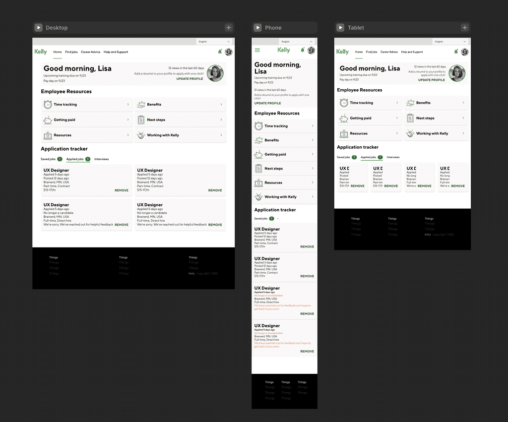
A fast, reviewable application experience with opt-out capability.
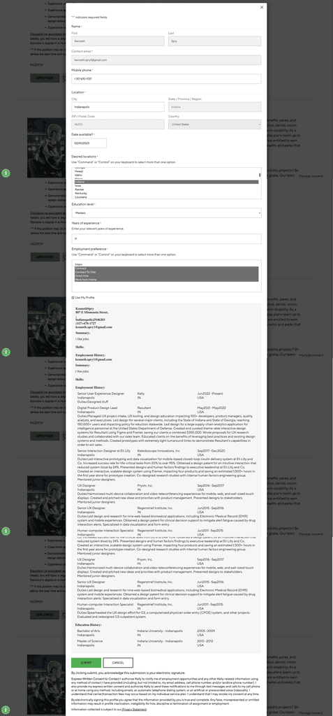
Prototype
We knew a few things for certain: 80% of our talent were first encountering our existing job board via mobile, they were getting lost in our ecosystem of websites, and we were losing existing talent when contracts would end. Our primary objective was to create a seamless mobile experience from job seeker to employee that enabled communication to our recruiters about our existing talent who might be in need of new work and provided suggested positions for them to apply to—even as they finish their current contracts. It's more expensive to find new talent than to retain them! The result was one application with a looping candidate-employee-candidate strategy.
Kelly Design System
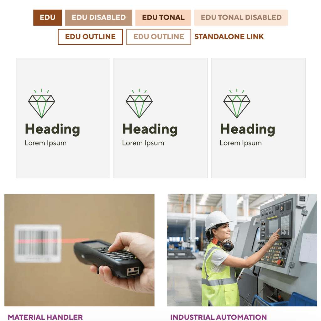
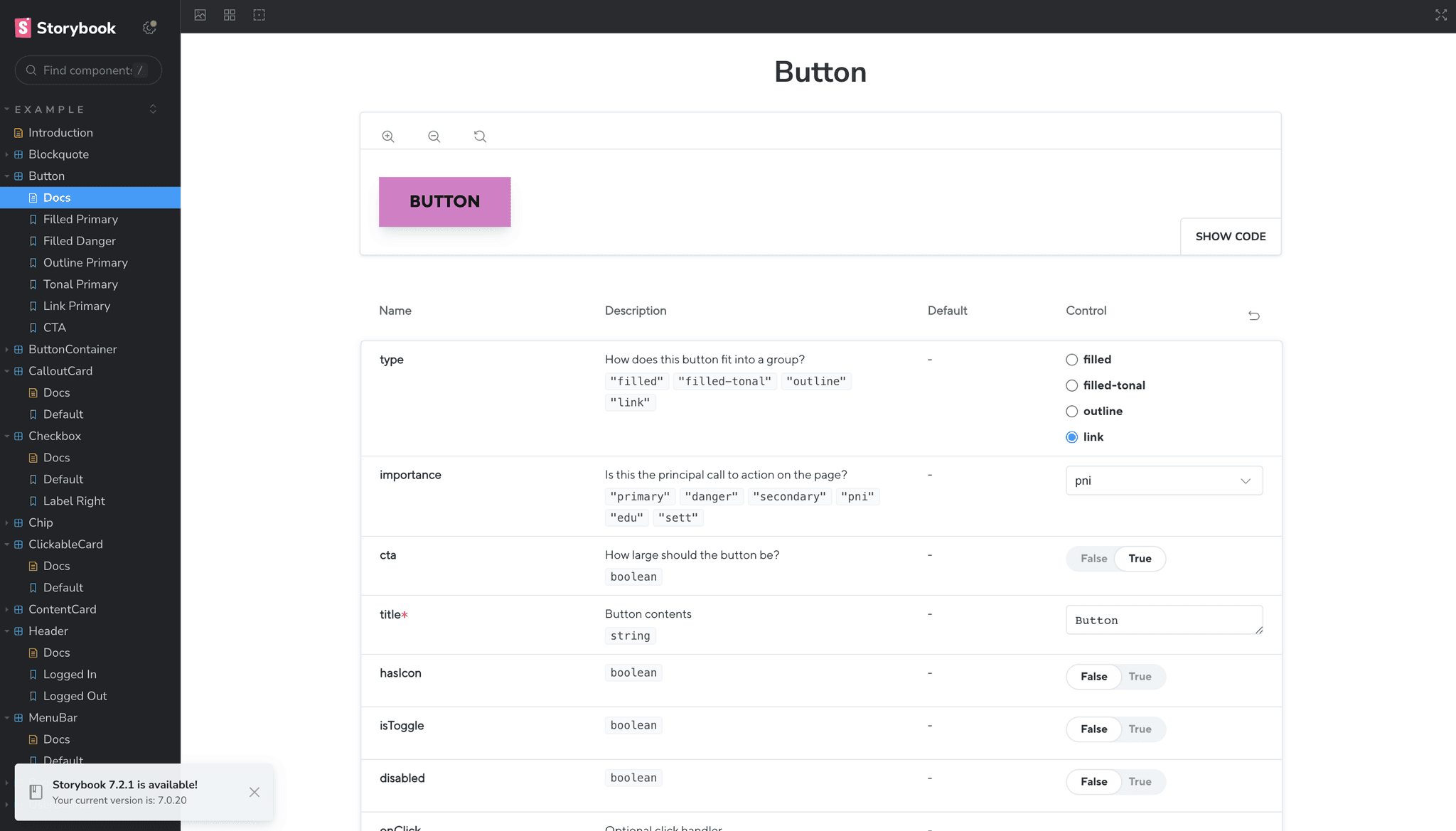
Using Figma's new variable feature, I was able to easily create a scalable, themeable design system that could be switched with the click of a button. I also distinguished app components and styles from marquee components and styles, although the two intersect at the lowest level of body copy, labels, and form components. This means app users can enjoy getting things done without a lot of flash while business stakeholders feel our brand is accurately relayed to our broader audience.
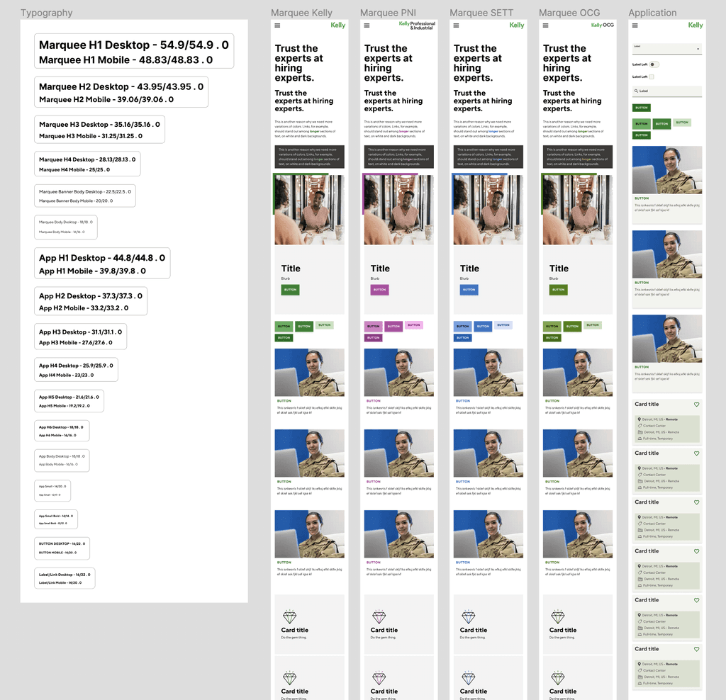
I didn't stop at Figma, though. I bounced between React/CSS/Storybook and Figma to create the scalable, accessible system with colors based on generated shades that came from our existing non-web-based brand guide. I used these additional technologies to make sure our animations and microinteractions were accurately modeled and translated as well as determining exactly how each component scaled at various sizes. To do this, I reused and modified a component library I made for the graduate course I teach and added a Storybook JS instance after my playground was in good shape. It might sound like overkill, but, with this extra effort, we were finally able to keep all our various vendor devs and designers focused on what mattered to us: the experience.